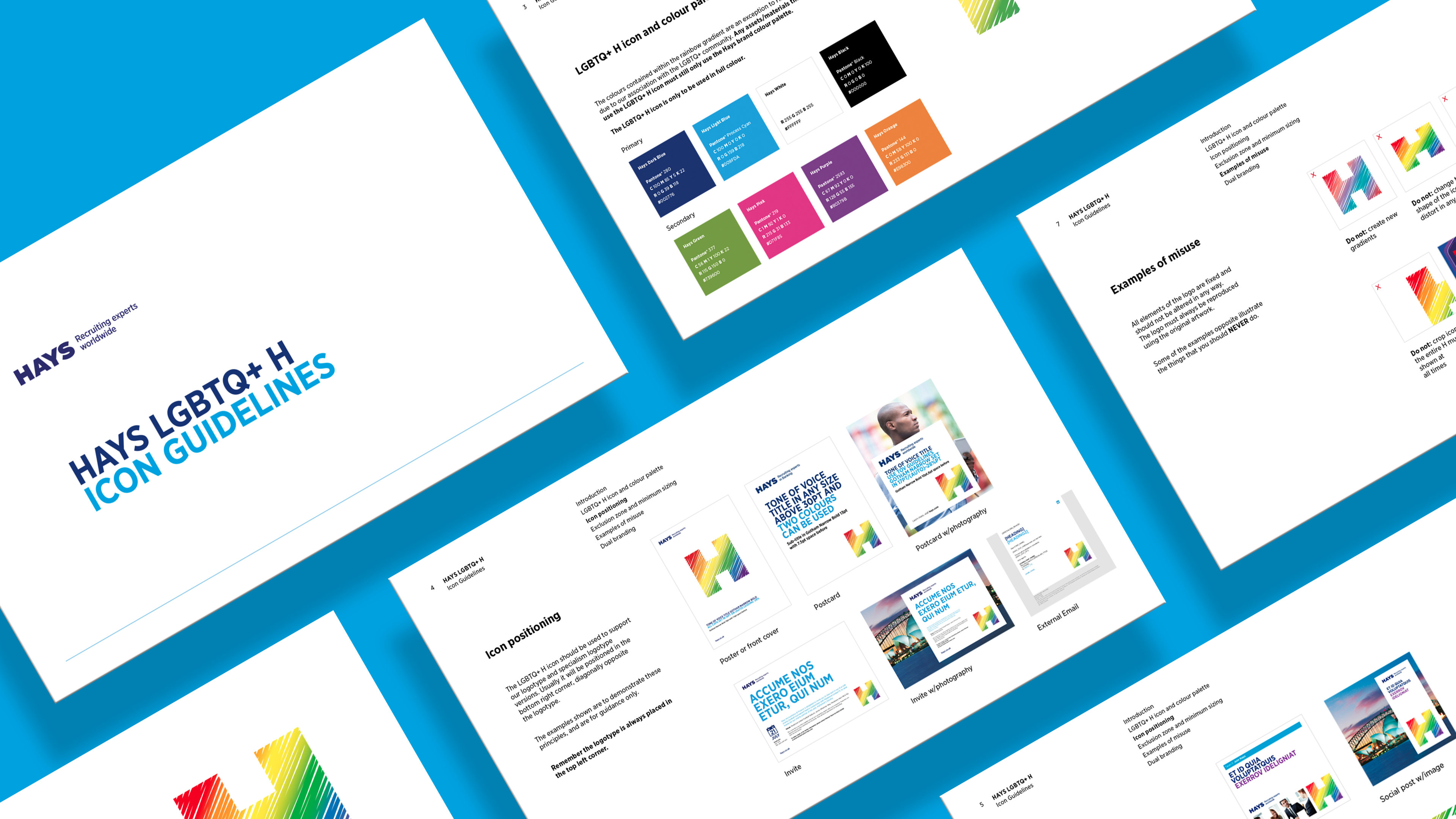
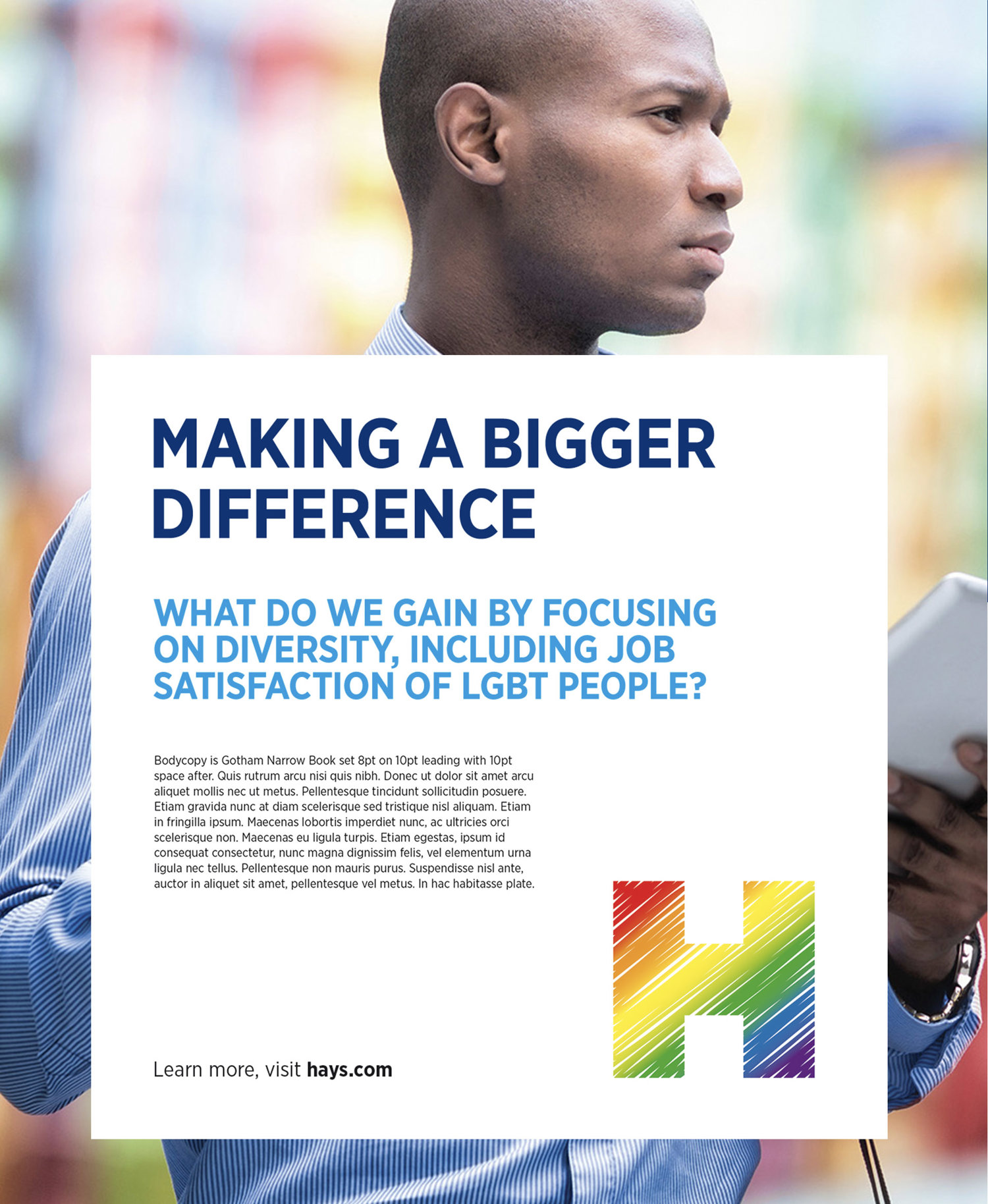
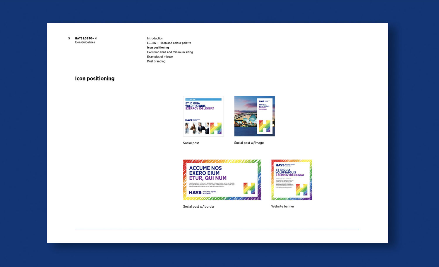
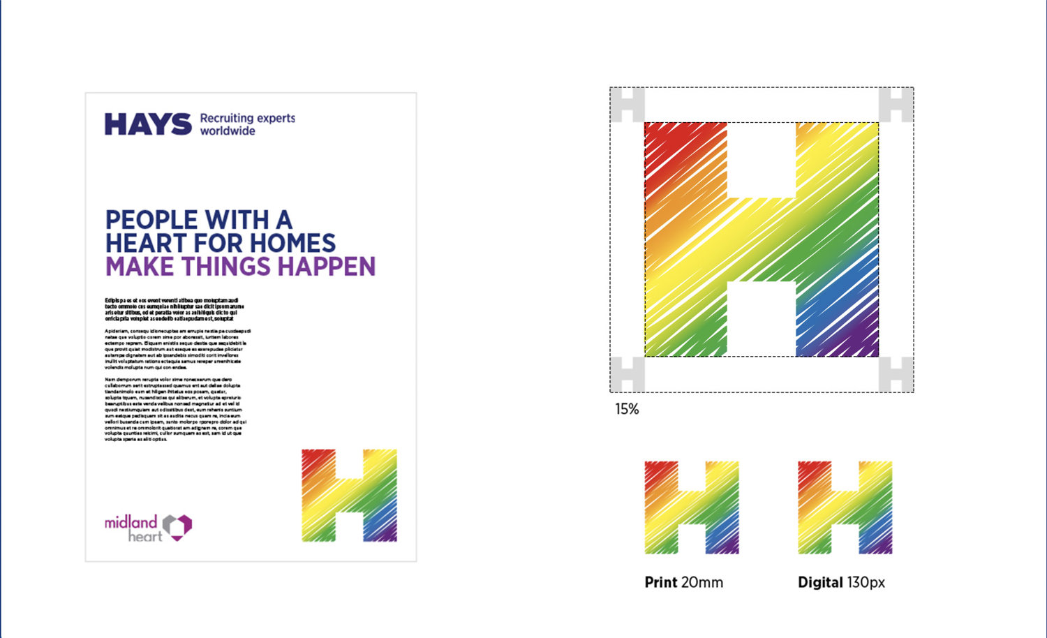
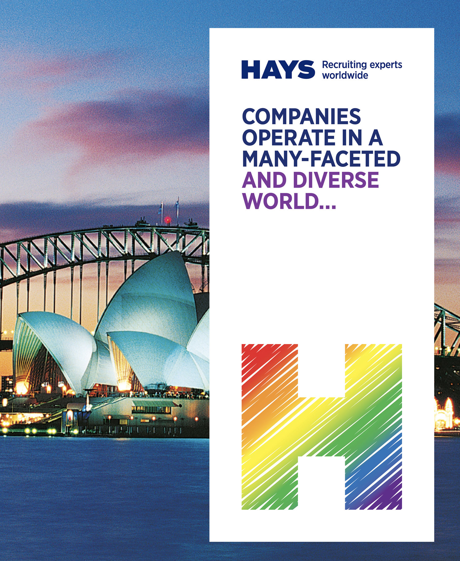
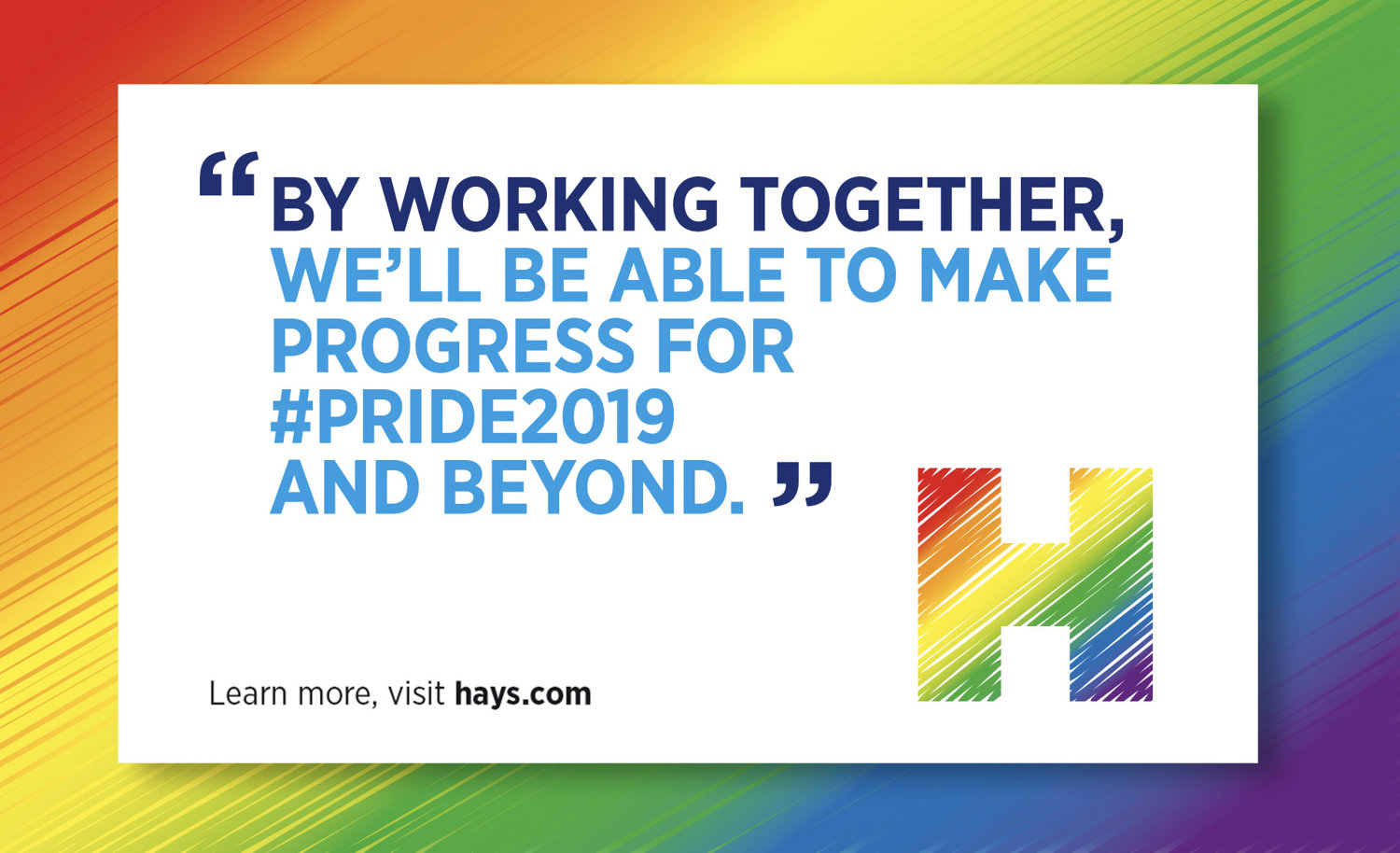
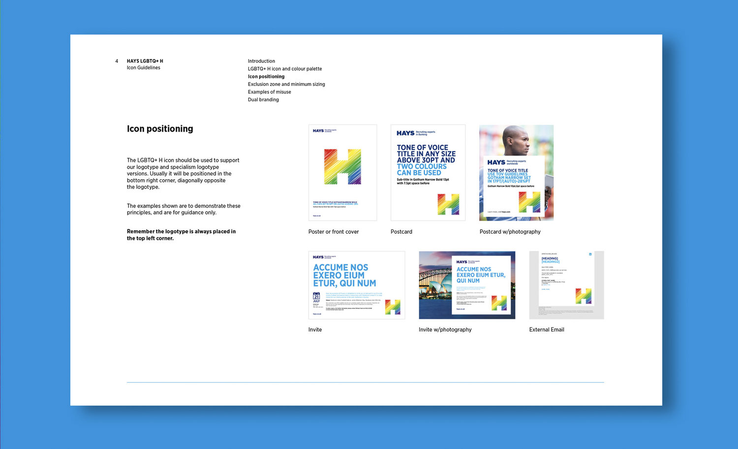
We were asked to create a new identifier to support their global initiative to create an internal Hays pride network. It needed to sit in line with their other H symbols but be obviously representative of the LBGQT network - with only 8 ‘H’ symbols in existence, Hays deemed the project to be of high importance. Leaning towards the pride rainbow was the obvious choice, but using a scribble style gave it a sense of freedom whilst retaining obvious recognition. The guide provided clear rules for usage and demonstrated the look across multiple touchpoints.